
AHAVA COMPANY
Public Space · Shaoxing
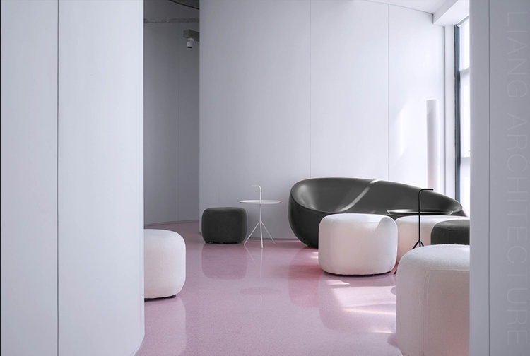
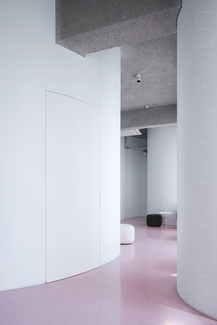
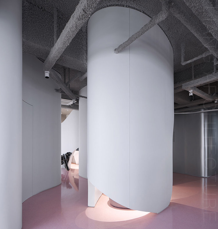
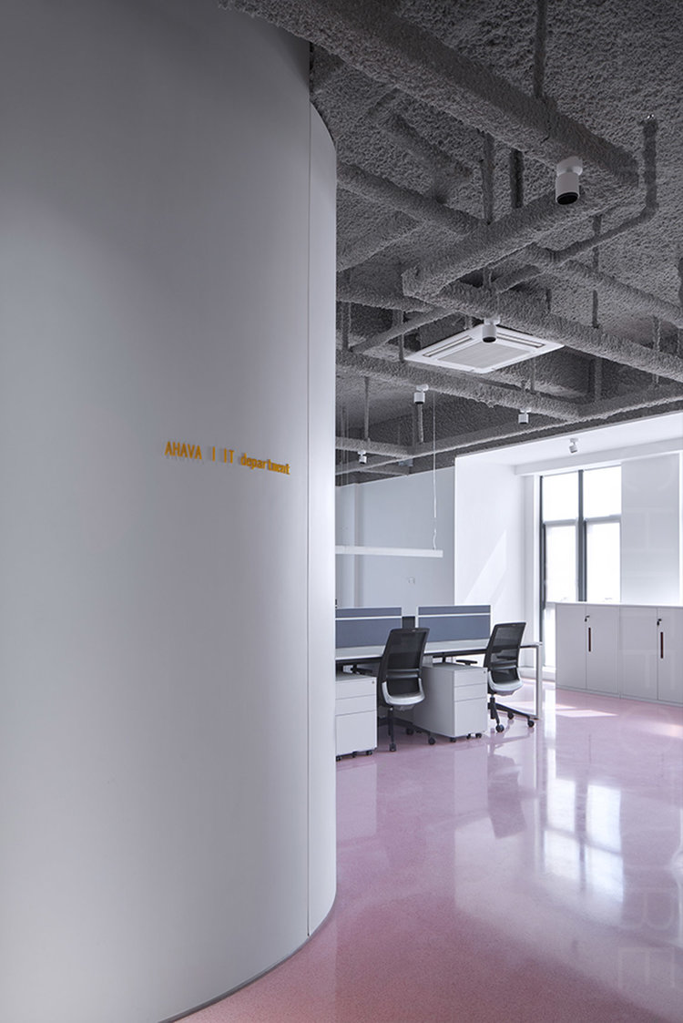
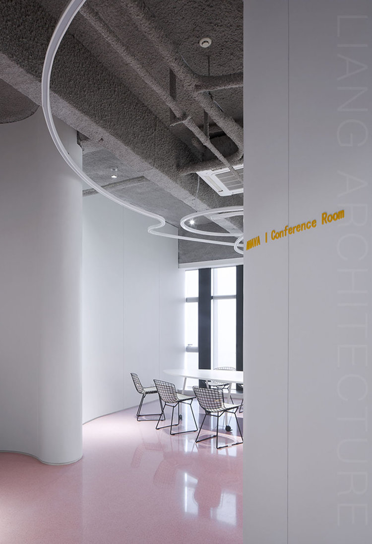
Pink color is the embodiment of femininity. It is the main body of not only the company's internal employees but also its external audiences. The pink road implies the organic combination of the two (internal collective intelligence and external customer needs).
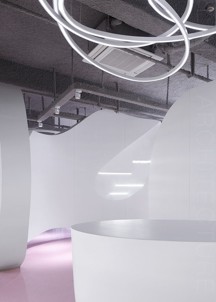
The pure white color like the flowing water is the metaphor for a developing company, which is independent of shape and yet harmony. Under the guidance of the unique culture and values of the enterprise, people always work together in one direction.
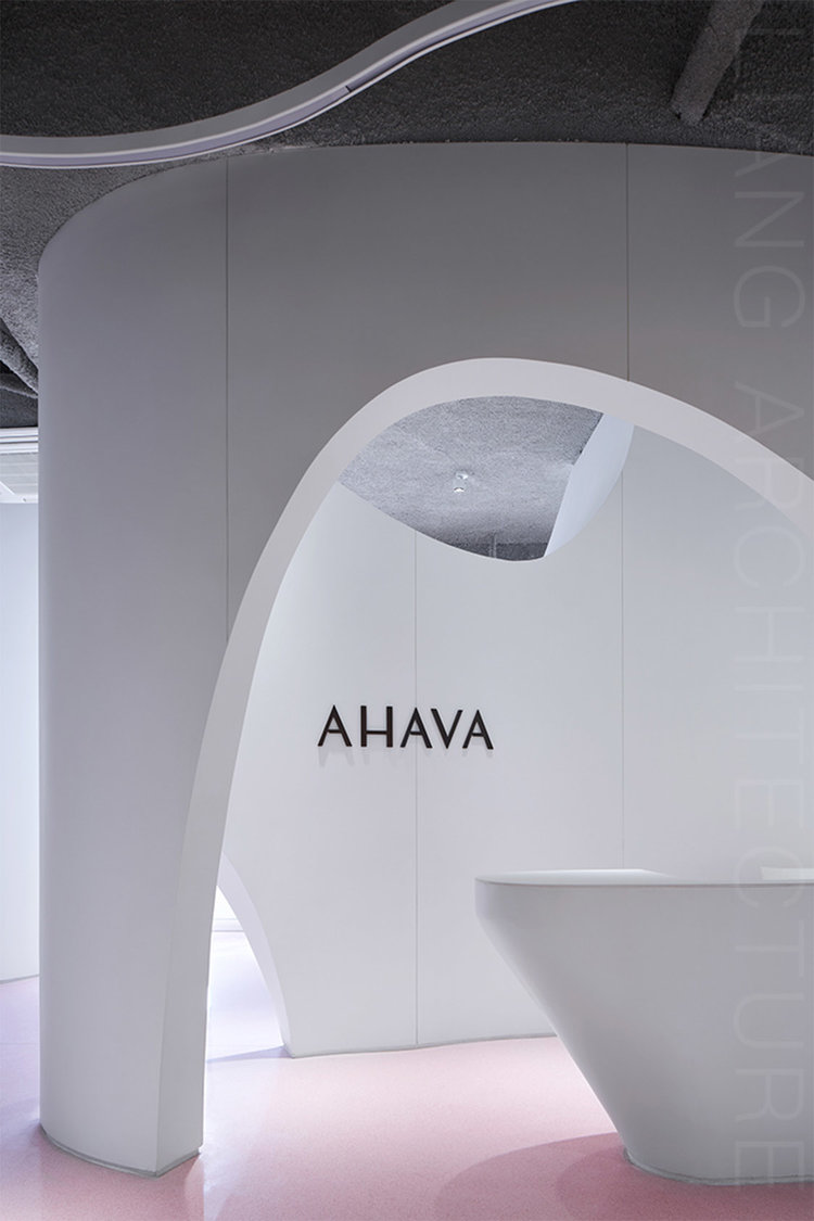
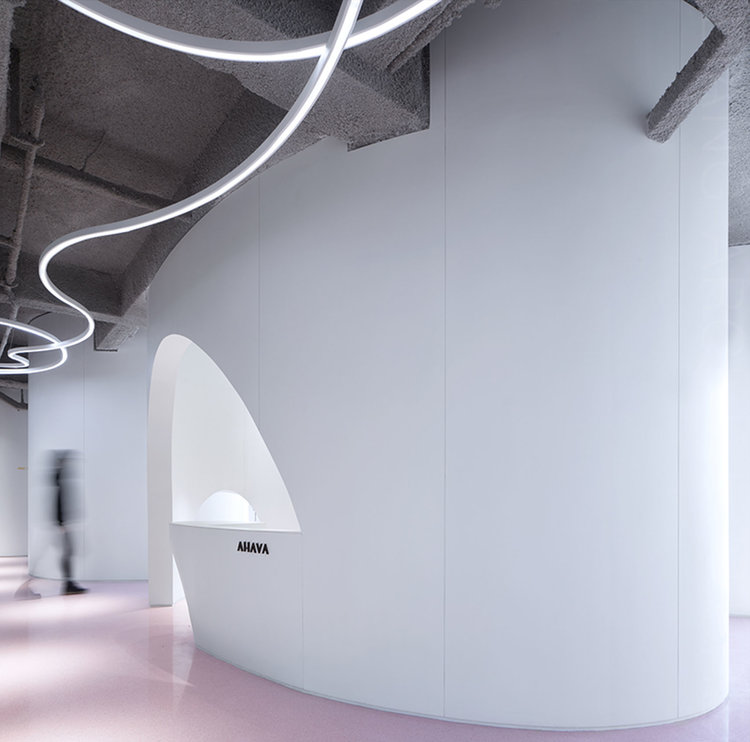

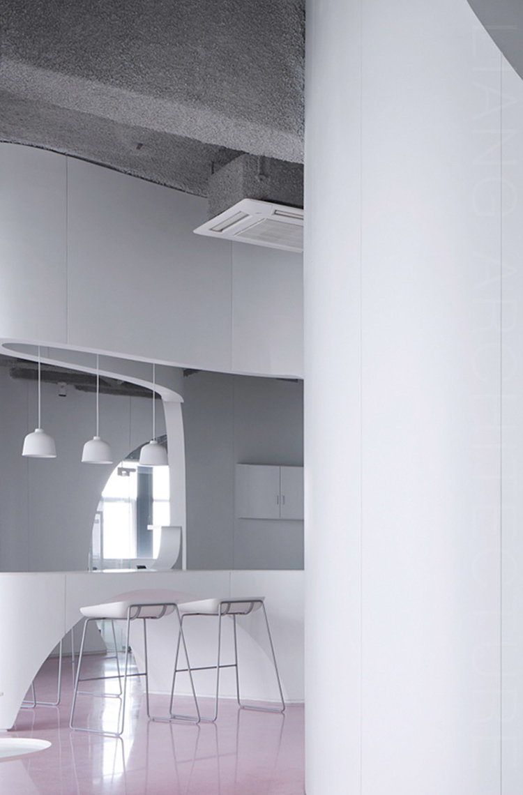
Space is created by things, and the difference in things helps to achieve inimitable regions with their own characteristics and distinctive features of their brands, just like the West Lake in Hangzhou and the Dead Sea in Israel. The AHAVA brand originates from the Dead Sea in Israel, so whether the moving line of each building block in the office space or the shape of the head space is more of a conceptional reappearance and an artistic expression of the island, water and algae elements of the Dead Sea. At the same time, it is just the right combination of function and partition, art and practicality, abstraction and concretization. The reason for the designer to choose the two colors of maiden pink and algae mud gray is not only for the space, but also a metaphor for the unique relationship between people and the products, which is the fundamental cause why the AHAVA brand can continue to conquer the global consumers.
INS: https://www.instagram.com/p/CAcNsaVJ4am/?igshid=14f2bb5ia8oqb